
How to style Blue Artwork in Scandinavian homes
Introduction to Blue Artwork in Scandinavian homes
There is a quiet confidence in Scandinavian interiors.
Nothing feels forced. Nothing feels excessive. Every element exists for a reason, and yet the space never feels rigid or overdesigned. It breathes. It allows light to move freely. It invites calm.
And within that calm, every detail matters more.
Because when you remove noise, what remains becomes significant.
This is exactly why art plays such an important role in Scandinavian homes. It is not just decoration. It is one of the few elements allowed to carry emotion, personality, and depth.
And among all possible choices, blue artwork has a unique ability to elevate these spaces in a way that feels both natural and intentional.
It does not disrupt the balance. It enhances it.
It introduces contrast, but in a controlled and refined manner. It brings in color without overwhelming the neutral palette. It adds emotional presence without cluttering the visual language of the room.
This is why blue portrait art, in particular, works so beautifully in Scandinavian interiors.
It aligns with the philosophy of simplicity, while quietly expanding the emotional dimension of the space.
Understanding the Scandinavian Design Philosophy
To understand how to style blue artwork effectively, you first need to understand the foundation of Scandinavian design.
At its core, it is about clarity.
Clean lines. Functional layouts. A restrained color palette built around whites, greys, soft beiges, and natural materials such as wood, stone, and linen.
There is a strong emphasis on light. Large windows. Minimal window treatments. Surfaces that reflect rather than absorb brightness.
But beneath this simplicity lies something deeper.
Scandinavian design is not cold minimalism. It is warm minimalism.
It values comfort. Texture. Subtle variation. It creates spaces that feel lived in, not staged.
And because the design language is so controlled, the introduction of art becomes a powerful moment.
It is one of the few opportunities to introduce contrast, narrative, and emotion without breaking the overall harmony.
Blue artwork fits perfectly into this framework.
It respects the palette while adding depth. It integrates without disappearing.
This approach works especially well with the Blue Series, where restraint and clarity match Nordic interiors.
Why Blue Works So Well in Scandinavian Interiors
Blue has a natural relationship with Scandinavian aesthetics.
It reflects the environment. The sky. The sea. The long, quiet winters. The shifting light.
But more importantly, it shares the same emotional tone.
Calm. Balanced. Understated.
In interiors dominated by neutral tones, blue acts as a gentle interruption. It creates a focal point without introducing visual chaos.
Unlike stronger colors, which can feel invasive in minimalist spaces, blue remains composed.
It does not fight the room.
It settles into it.
This is especially true when working with deeper, desaturated blues, where the color carries richness without becoming overwhelming.
In a white or light grey interior, a blue portrait adds depth.
In a warmer, wood-based space, it creates contrast.
In both cases, it enhances rather than disrupts.
And that is the key.
Choosing the Right Blue Artwork
Not all blue artworks will work in the same way.
The difference lies in tone, composition, and emotional weight.
In Scandinavian interiors, restraint is essential. This means avoiding overly busy compositions or overly saturated colors that compete with the calmness of the space.
Look for artworks that feel balanced.
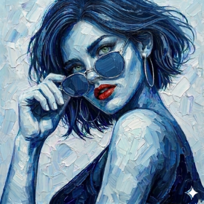
Portraits with strong composition but subtle expression. Pieces where the color palette is cohesive, where the blue tones shift rather than clash.
Texture is also important.
Brushstrokes, layered paint, or subtle variations in tone create depth without adding visual noise. This aligns with the tactile qualitblue artwork Scandinavian interiors
It also reinforces why blue portrait art feels powerful in interiors.
Blue Artwork in Scandinavian homes
y often found in Scandinavian design, where materials like wool, wood, and ceramics bring softness to minimal forms.
Scale matters as well.
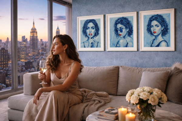
A larger artwork often works better than multiple smaller pieces. It creates a single focal point, which feels more intentional and less cluttered.
One strong piece is enough.
In fact, it is often better.
Placement – Where Blue Art Works Best
Placement is not just about wall space. It is about flow.
In Scandinavian interiors, rooms are often open and connected. Sightlines matter. What you see from one space affects how the entire home feels.
This means your artwork should be placed with intention.
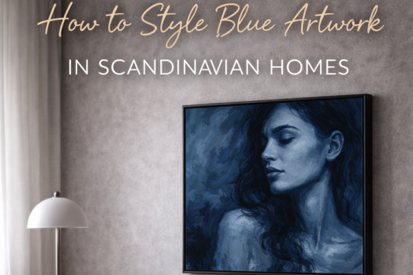
Above the sofa is a classic choice, and for good reason. It creates an anchor in the living room and immediately draws the eye.
But consider other placements as well.
A hallway can benefit from a single strong portrait, turning a transitional space into something meaningful.
A bedroom allows for a more intimate connection, where the artwork contributes to a sense of calm and personal space.
Even a dining area can be transformed by the right piece, adding depth without distracting from the simplicity of the setting.
The key is balance.
The artwork should feel integrated, not added.
Styling Around the Artwork
Once the artwork is in place, the surrounding elements should support it.
Not compete with it.
In Scandinavian interiors, this usually means keeping the surrounding palette neutral and the materials natural.
Soft textiles. Light woods. Matte finishes.
Let the artwork be the strongest visual element.
At the same time, subtle connections can enhance the overall composition.
A cushion with a hint of blue. A ceramic piece with a similar tone. A throw that echoes the color in a soft, understated way.
These details create cohesion.
They tie the room together without making it feel designed around the artwork.
Because the goal is not to match.
It is to harmonize.
Light, Texture, and Atmosphere
Light plays a crucial role in how artwork is experienced.
In Scandinavian homes, natural light is often abundant, but it changes dramatically throughout the day.
Morning light is soft. Midday is bright. Evening becomes warm and diffused.
Blue artwork responds beautifully to these shifts.
It can appear lighter, almost airy, in strong daylight. Then deeper, more intense, in softer light.
This dynamic quality adds another layer to the space.
It means the artwork is never static.
It evolves with the environment.
Texture enhances this effect.
The way light interacts with the surface of a fine art print, especially when printed on high-quality paper, creates subtle variations that bring the piece to life.
It becomes more than an image.
It becomes an experience.
Creating a Calm but Expressive Space
The goal of Scandinavian design is not emptiness.
It is balance.
And blue artwork helps achieve that balance by introducing emotion into a controlled environment.
It prevents the space from feeling too sterile. Too perfect.
At the same time, it does not overwhelm.
It sits comfortably within the design language.
This is what makes it so powerful.
It allows you to create a space that feels both calm and expressive.
Minimal, but not empty.
Refined, but not cold.
When placed correctly, the artwork becomes a focal point, similar to statement art in modern spaces.
Creating Visual Balance Without Overstyling the Space
One of the most common mistakes when styling artwork in Scandinavian interiors is the tendency to overcompensate, where the addition of a strong visual element like a blue portrait leads to unnecessary layering of decor, colors, or accessories that ultimately disrupt the calm and intentional nature of the space.
The strength of Scandinavian design lies in restraint, and that restraint becomes even more important when introducing statement art, because the artwork itself should carry the visual and emotional weight without needing support from excessive styling around it.
When you place a blue artwork in a room, especially a portrait with depth and presence, it already establishes a focal point, which means the surrounding elements should step back rather than compete for attention.
This does not mean the space should feel empty, but rather that every object should feel considered and necessary, where textures, materials, and forms work together quietly instead of trying to stand out individually.
A soft linen sofa, a muted wool throw, a ceramic vase with subtle organic shapes—these elements create a backdrop that allows the artwork to breathe, while still contributing to the overall atmosphere of the room.
The key is to think in layers, but not in clutter.
You want visual softness rather than visual noise.
This is why neutral tones remain essential, even when introducing color through art, because they allow the eye to move naturally through the space without interruption, eventually settling on the artwork as the central point of focus.
And when this balance is achieved, something interesting happens.
The room feels more refined, more intentional, and more complete—not because there is more in it, but because nothing feels unnecessary.
The artwork becomes part of the architecture of the space, not just something added onto the wall.
Scaling Artwork Correctly for Maximum Impact
Scale is one of the most overlooked aspects of interior styling, yet it is often the single factor that determines whether a space feels professionally designed or unintentionally incomplete, especially when working with statement pieces like blue portrait art.
In Scandinavian interiors, where furniture is often low-profile and layouts are open, the wrong scale can immediately break the harmony of the room, either by making the artwork feel insignificant or by overwhelming the space entirely.
A common mistake is choosing artwork that is too small, which creates visual fragmentation and forces the viewer’s eye to search for a focal point rather than naturally settling into the composition of the room.
Instead, a larger piece—particularly in formats like 80×80 cm or 120×120 cm—creates presence.
It establishes authority.
It gives the room direction.
When placed above a sofa, the artwork should ideally span a significant portion of the furniture width, creating a visual connection between the two elements, rather than appearing as an isolated object floating on the wall.
This relationship between artwork and furniture is subtle, but it is what creates cohesion.
At the same time, spacing around the artwork is equally important.
Too much empty space can make even a large piece feel disconnected, while too little space can make it feel cramped.
The goal is balance.
Breathing room, but not isolation.
And this is where blue artwork excels, because its depth allows it to hold space more effectively than lighter or more fragmented compositions, meaning it can anchor a wall without requiring additional pieces to support it.
In this sense, choosing the right scale is not just a technical decision.
It is an emotional one.
Framing and materials also play a role, as shown in wooden frame examples for art display, where subtle details elevate the final result.
Explore the Blue Series
The Blue Series was created with this exact balance in mind.
Each piece is designed to integrate seamlessly into modern interiors while adding emotional depth and presence.
The portraits are built around subtlety. Around tone. Around the quiet strength that defines contemporary feminine expression.
In Scandinavian homes, they become more than artworks.
They become part of the atmosphere.
Part of the rhythm of the space.
And over time, they begin to define it.