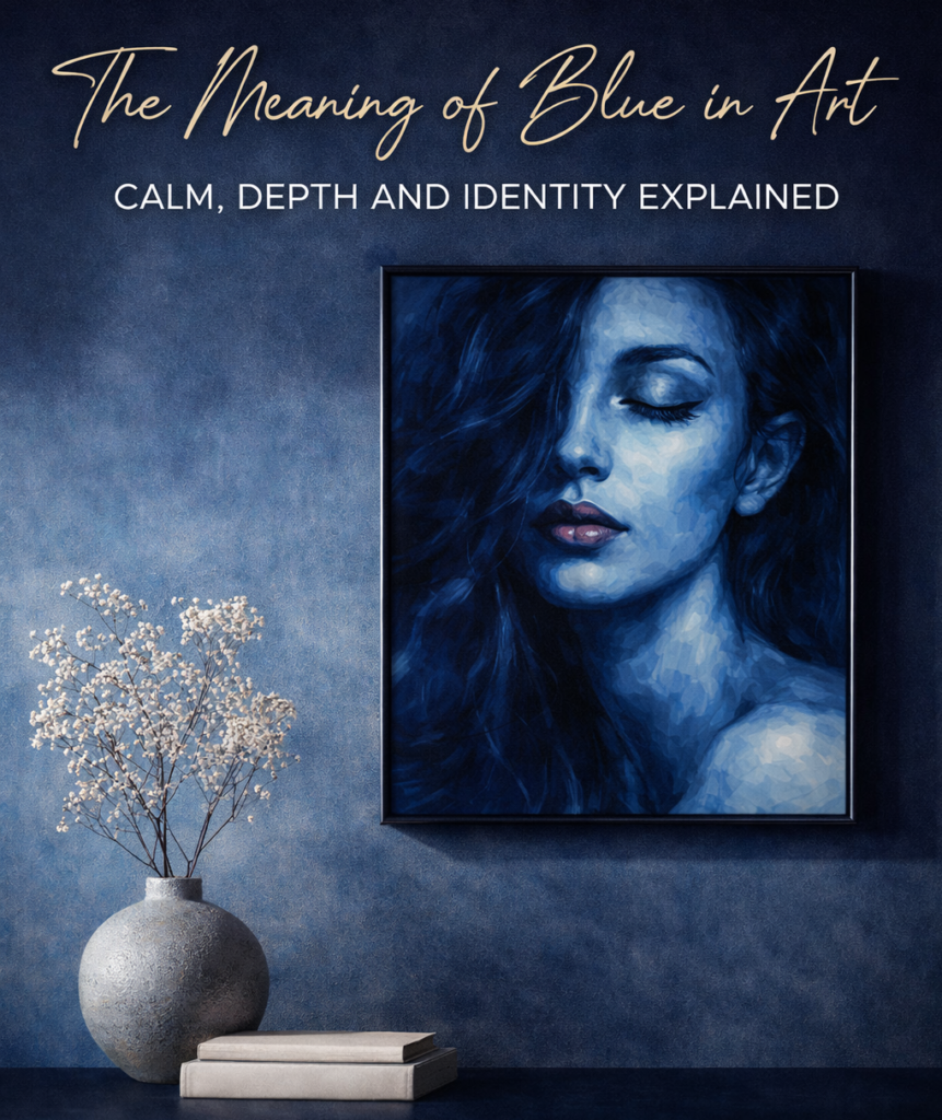
The meaning of blue in art – calm, depth and identity
Introduction to meaning of blue in art
Blue has a way of slowing everything down.
It doesn’t rush the eye. It doesn’t compete for attention. Instead, it creates space – a kind of visual silence that feels rare in today’s world. And within that silence, something deeper begins to emerge.
In art, blue has always carried meaning beyond the surface. It’s not just a color. It’s a mood. A state of mind. A subtle language that speaks through tone rather than form.
When applied to portrait art, its effect becomes even more powerful. Faces rendered in blue shift away from literal representation. They become something else – more internal, more reflective. Less about appearance, more about presence.
This is why blue portrait art continues to resonate in contemporary visual culture. It offers something that feels grounded, controlled, and quietly expressive.
Not loud. Not decorative. But deeply intentional.
Blue as Calm – The Power of Stillness
Calm is often misunderstood. It’s seen as passive. As something soft or even weak.
But in art, calm can be incredibly powerful.
Blue embodies this kind of strength. It holds the composition together without forcing it. It creates balance. Stability. A sense that everything is exactly where it should be.
In portrait art, this translates into presence. The subject doesn’t need to move or perform. They simply exist. And that existence becomes enough.
There is no urgency in blue. No pressure to react. This allows the viewer to slow down as well. To look longer. To notice more.
And in that extended attention, the artwork begins to unfold.
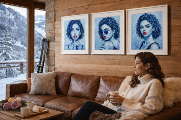
This emotional depth becomes especially visible in the Blue Series, where blue is used as both structure and atmosphere rather than decoration.
Blue as Depth – Beyond the Surface
One of the most defining qualities of blue is its ability to suggest depth.
Not just visually, but emotionally.
Darker tones can feel almost endless. Like looking into water or sky. There is always something beyond what is immediately visible. Something just out of reach.
This is where blue moves beyond decoration and into meaning.
In contemporary portrait painting, this depth allows the subject to exist on multiple levels at once. The face is there. Recognizable. But the emotional reading is never fixed.
It shifts.
Depending on light. On distance. On the state of the viewer.
This fluidity gives blue portrait art its longevity. It doesn’t reveal everything at once. It evolves over time.
Blue as Identity – A Different Kind of Expression
When a portrait is rendered in natural color, it often feels specific. Tied to a moment. A person. A reality.
Blue changes that.
It removes the subject from the literal world and places them somewhere more interpretive. More universal.
The identity becomes less about who the person is, and more about what they represent. A feeling. A state. A presence.
This is particularly relevant in modern feminine art.
Here, identity is not defined by external features alone. It is shaped by posture, expression, and the subtle tension within the composition. Blue allows these elements to take center stage.
The result is a form of expression that feels both personal and collective. Specific, yet open.
Blue in Contemporary Art and Interiors
In modern interiors, blue functions differently than brighter or more saturated colors.
It integrates.
It adapts.
And yet, it still holds weight.
This is why blue portrait art works so well as wall art for interiors. It doesn’t overwhelm the space. It enhances it. Adds depth without disrupting balance.
In Scandinavian environments, where light and neutrality dominate, blue becomes a natural extension. It introduces contrast, but in a controlled way.
The artwork becomes part of the atmosphere. Not just an object within it.
To see how these tonal variations are built from the ground up, explore the process behind the Blue Series.
Why Blue Continues to Matter
Trends in art come and go. Styles shift. Techniques evolve.
But blue remains.
Not because it is neutral. But because it is complex.
It can carry emotion without excess. It can create presence without noise. It can hold attention without demanding it.
This balance is rare.
And it is precisely what makes blue such a powerful tool in contemporary art prints and portrait painting.
This is also why blue portrait art feels so powerful in modern interiors, where color directly influences the emotional tone of a space.
A Living Expression
The meaning of blue is not fixed. It changes depending on context, composition, and intention.
In some works, it feels calm. In others, distant. In others still, deeply emotional.
But it always holds something beneath the surface.
Something worth returning to.
Blue as Identity – Personal Expression Through Color
Blue is not just a color. It is a language. Quiet, but unmistakably present.
In contemporary portrait art, blue often becomes a mirror. Not of appearance, but of identity. It strips away distraction. Removes the expected. Leaves only essence.
When a face is rendered in blue, something shifts. Skin is no longer skin. It becomes emotion. Thought. Memory.
This transformation allows the viewer to move beyond the surface. You are not looking at a person anymore. You are looking into a state of being.
And that is where blue becomes powerful.
Unlike warmer tones, which often communicate immediacy or intensity, blue invites distance. Reflection. It slows the gaze. It asks you to stay longer.
In the Blue Series, this is intentional. The portraits are not designed to shout. They are designed to resonate.
There is a subtle tension between strength and vulnerability. The figures appear calm, almost detached. Yet beneath the surface, there is depth. A quiet intensity that unfolds slowly.
It is this duality that makes blue so effective in modern portraiture.
For many collectors, this is where the connection happens. The artwork does not dictate meaning. It leaves space. Space for interpretation. Space for projection.
And in that space, identity becomes fluid.
Each viewer sees something slightly different. A mood. A memory. A version of themselves.
That is the beauty of working within a monochromatic palette. It removes noise and amplifies feeling.
Blue becomes more than color. It becomes presence.
The emotional qualities of blue also explain why blue portrait art feels so powerful in modern interiors, where color directly shapes the mood of a space.
Why Blue Art Works So Well in Contemporary Spaces
There is a reason blue artwork feels instantly at home in modern interiors. It adapts. It balances. It elevates.
In contemporary design, restraint is everything. Clean lines. Neutral palettes. Thoughtful contrasts. And within that framework, blue becomes a perfect anchor.
It introduces color without overwhelming the space.
A deep blue portrait against a white or grey wall creates tension. In the best possible way. It draws the eye, but it does not dominate. It holds attention.
This is especially important in Scandinavian and minimalist interiors, where every object must justify its presence.
Blue art does exactly that.
It adds depth to otherwise quiet environments. It softens hard architectural lines. It introduces a human element without disrupting the aesthetic.
And then there is the emotional layer.
Spaces are not just visual. They are felt.
A room with blue artwork often feels calmer. More grounded. More intentional. The color subtly influences atmosphere, creating a sense of balance.
In living rooms, blue portraits become focal points. In bedrooms, they bring calm. In hallways, they create continuity.
They work across spaces because they are versatile. Cool tones blend easily with wood, stone, and neutral textiles. They complement both modern and classic furniture.
But perhaps most importantly, they feel timeless.
Trends change. Colors come and go. But blue remains.
It has been used for centuries in art. And it continues to feel relevant today.
That makes blue artwork not just a design choice, but an investment in longevity.
Something that will not feel outdated next season.
Something that will continue to resonate, quietly, year after year.
Closing
Color is never just color.
It carries weight. Meaning. Memory.
And in the case of blue, it carries something else as well – a sense of space. Of clarity. Of quiet control.
The kind of presence that doesn’t need to be explained.
Only experienced.
The importance of material becomes even clearer when looking at how Hahnemühle paper gives longevity to art prints, where texture and durability directly affect perception.